Nothing Phone (1): The supposedly disruptive design looks like an iPhone

Read in other languages:
Nothing, the cool and trendy startup of Carl Pei, co-founder of OnePlus, is preparing the launch of the Nothing Phone (1), its first smartphone that is supposed to disrupt this market that has become so boring and non-innovative. But the first snippets of the Nothing Phone (1) design teased on Twitter simply look like the design of an iPhone 13.
TL;DR
- Nothing teased parts of the design on the back of its Nothing Phone (1) on Twitter.
- We can guess straight and angular slices and a large camera lens.
- The Nothing Phone (1) is scheduled to be launched on July 12, 2022.
I know I'm showing it very badly, but I'm still very hyped for the Nothing Phone (1) launch. I really want to check out this smartphone, and I sincerely want to see Nothing turn its original gimmick into a real product philosophy. But with all this infinite teasing Nothing is doing on social networks, I'm starting to get tired of seeing them blowing smoke.
Since June 13, Nothing has been teasing the dowel and going for the hype by revealing some tiny parts of the design on the back of its Nothing Phone smartphone (1).
Hello pretty.
— Nothing (@nothing) June 14, 2022
See you tomorrow.
Nothing (event) - Return to Instinct.
➡️https://t.co/FEJL4Jb2Aw pic.twitter.com/FmlvnQcgX9
So we were treated to two beautiful 3D visuals of colorful parakeets perched on the Nothing Phone (1) of which we can only glimpse a part of the upper cross-section and the right side edge, both seen from behind. As a reminder, the latest rumors agree on a transparent design for the Nothing Phone (1), in the same line as the one adopted by the Nothing Ear (1) headphones tested here at NextPit.
The only visible parts of the smartphone being white on a white background, the transparent side of the Nothing Phone (1) is not really noticeable. But, in response to one of Nothing's latest tweets, some people had fun making collages with the few visuals shared by the brand.
With this montage worthy of my collages made on GIMP, we can see that the look of the Nothing Phone (1) is not as disruptive as expected. At least in my eyes.
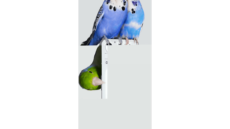
We find straight and angular metallic edges, rounded corners and a big circular camera lens on the top left of the back of the smartphone. In short, the Nothing Phone (1), at least what we can see of it, looks no more and no less than an iPhone 13. Personally, I don't feel too transcended and my hypometer is as low as the step counter of my smartphone (that's a joke about me not moving enough).
Last point, after I promise I'll stop blowing smoke around two poor JPEGs published on Twitter. But this look, or this part of the design, looks a bit like the concept of the Nothing Phone (1) by the well known Ben Geskin.
Nothing phone (1) Concept
— Ben Geskin (@BenGeskin) May 29, 2022
Do you think the final design will be similar to this? Or will it be something completely different? pic.twitter.com/tQ2UwFfYXg
Anyway, I'll let you make your own opinion. But I'm curious to know what you think of the Nothing Phone (1) design. Do you think it looks like an iPhone, too? And what do you think about my ability to stitch a 600 words article from a photo collage made by a complete stranger (@Kunal1696, thank you!)?






He's using the generic hardware designs the industry supplies and dressing it up with hype. Unless he has better driver integrators than he did at one plus, this is going to stink at release.