Poll of the week: Android 12 and its new Material You design, do you approve or not?
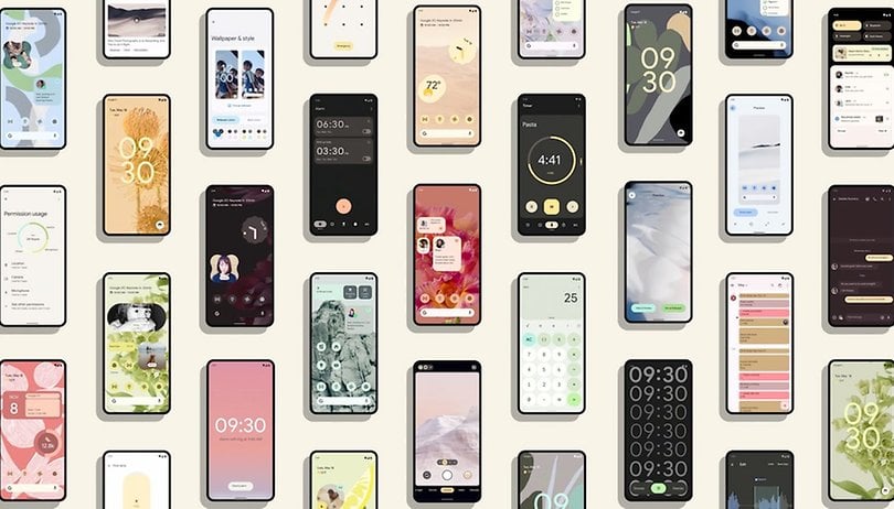

Last week, Google was the center of attention with its Google I/O event, design leaks for the Pixel 6 phone and especially the Android 12 beta, which marks a major change in the system's visual identity. And according to our community, the new interface design has already started on the right foot.
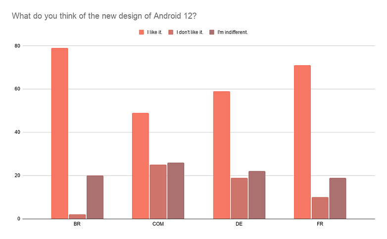
To be honest, I expected much more divided results when I published the poll last week. But the redesign of Android 12 overwhelmingly won NextPit community around the world.
In France, the number of respondents who said they liked the new design of the Google operating system was 71% and our Brazilian readers supported the change with 79%. In Germany and with our English-speaking readers, the rate of rejection and indifference was higher, but we still have 59% and 49% of people enjoying the design of Android 12.
Many of you will not have Android 12
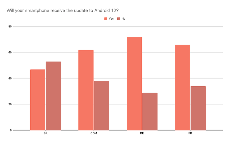
It is interesting to note that the second question in the poll highlighted a significant proportion of people who will not benefit from the update to Android 12. In Brazil, more than half of the people answered that they have a cell phone with no prospect of updating to the new system.
But even among readers in France and Germany, the share of people who will not have Android 12 on their devices was 34% and 29%, respectively. This is too much for me and reinforces the urgency with which manufacturers must review their software updates and support policies.
On the other hand, some readers, such as the German Udo Kallina, simply do not feel the urgency to adopt a new version:
I have an LG G6 with Android 9 and a Samsung A51 with Android 11. Android 11 is no better than 9, except for a few minor details in the new version. Android is dead in my opinion. Too bad I can't pay for an iPhone with at least 5 years of updates.
Others will argue that skins like MIUI 12 offer almost all features, even without a major Android update, as a French reader commented. Later on, I intend to prepare an article about it, with a complete comparison (between MIUI 12 with and without Android 11, for example) to see if the Mi fans are right.
Are Android and iOS more and more alike?
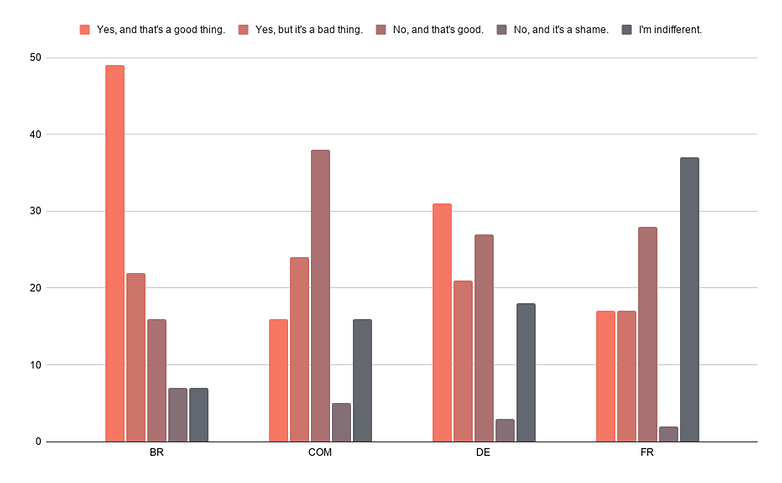
Finally, I asked about the gradual approach between Android and iOS visually. And the responses were so varied that I really got the impression that most of you responded in moderation or without much conviction.
Only the majority of Brazilian and German readers (a very relative majority of 31% in Germany) felt that there was an approximation and that it was positive, in France I found the most total indifference and I must say that I am very proud of my compatriots not having participated in this debate.
The readers of NextPit.com, meanwhile, rejected any visual connection between Android 12 and iOS 14, including thanking the visual diversity.
Conclusion
Well, there is no need to write about results that speak for themselves. You overwhelmingly endorsed the visual changes made by Google to the Android 12 interface. There is nothing more to say, except that I was shocked by the number of people with no hope of relying on the update for Android 12.
But a significant part of you just don't wait for each new version of Android any more like before. Visual changes, when appreciated, are sometimes considered too discreet to justify a device change to benefit from the update. It is a little sad, but it reinforces the impression that manufacturers like Samsung, which are struggling in terms of software updates, are on the right track and the competition should really follow suit.
Thanks again to all of you for participating in this poll, do not hesitate to comment on my analysis of the results or to suggest other subjects that could be a topic for further research!
Original text
The first beta of Android 12 was just released this week after Google I/O 2021, and the mobile OS is beginning perhaps the biggest visual change in its recent history. The opportunity to take a poll and ask you whether you approve of the new look of Android 12 or not.
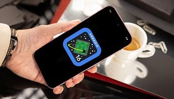
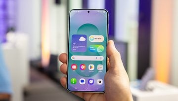
Material You, a more customizable interface that's "made for you", as Google claims on its official Android 12 beta page. Google's OS actually marks two significant changes in its graphical identity: the color palette applicable to the system theme and the design/shape of the widgets.
Personally, I really like what I've seen in the videos and other screenshots available online. But one of my former colleagues and Pixel fan who installed the beta found that the default menu looked like his grandfather's Samsung menu when he couldn't find his glasses.
Well, he told me that joke in English, so it was funnier. But still, every UI design change is divisive. That's why it would be interesting to see you decide.
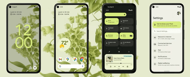
The new design of Android 12, you validate or not?
For once, our poll will settle for a simple "yes or no" question. I just want to know if you like the new design of Android 12 or not. That's it, no tricks.
And yes, I did lie. My sick curiosity forces me to ask you one last question, after which this poll will be over I promise! I'd like to know whether you said you like the new design or not, how many of you own a smartphone (used daily!) that will receive the update to Android 12?
If you don't know, you can check our Android 12 update tracker that we update every week with new models. Maybe yours is on there.
Well, okay, I know I was only supposed to ask one question. But this time, this is it. After this, I won't ask you anything else. To finally finish this poll, I'd like to know if you agree with me that Android and iOS are getting closer and closer in terms of design and if you think that's a good thing or not.
That's it for this poll, which is finally longer than expected. Thanks in advance to all participants. I invite you to expand on your choices in the comments. I always insist on this, I know, but it's your detailed opinions that count, more than the statistics. And if you have any ideas for new polls to submit to the Community, don't hesitate!





These UI changes are just set dressing. Give me guts changes like full permission control, full hosts file control. The UI is simple enough to dress however you actually like it that it's just immaterial. It's been ugly for years, will remain ugly for years to come as they play their metaphor games. I'm fine with simple flat icons and regular colors. I don't interact with that part of the UI a whole lot anyway.